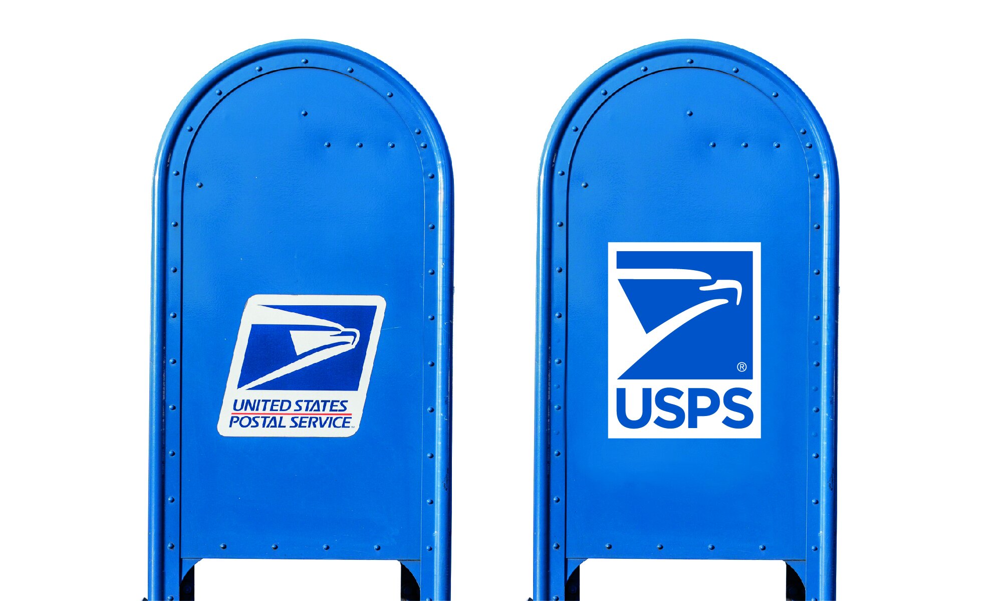
USPS Brand Simplification
_Conceptual exploration
McCann NY approach me to support an opportunity to explore the potential of a USPS refresh.
The opportunity arose due to the need by USPS to upgrade it fleet of vehicle.
In 1993 the current “sonic” eagle was introduced as the new corporate logo.
At the start of the exploration it was made clear to me the logo was out of bounds. I posed the question:
”Is the current sonic eagle fit for purpose across changing new platforms and social media?”
The approach was to explore simplification and open debate over the possibility of a brand refresh.
Examples below is some of the work explored for discussion purposes only.
McCann NY_FutureBrand London
1. 1829_1837 2.1837_1970 3.1970_1983 4.1983_Present


